
other design-related experiences.
'ehh apparel' start-up company ad work // 2019
I was part of the entire development process for creating the ads: from shooting the photos (and modelling in some of them due to not enough models), to editing them, to offering graphic design advice. The CEO of the company intended for this clothing line to express his personality by making fun of other clothing brands by not taking itself too seriously - hence, models being directed to make funny expressions and do unconventional advertising poses, as well as the unformal graphic design style.
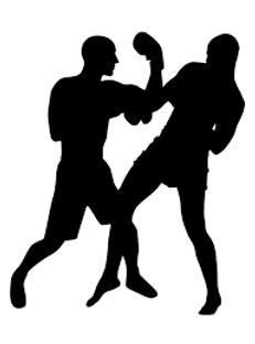
ukc kickboxing logo submission // 2019
Specifications of the logo included: had to be 2 people fighting; had to include details, not just silhouettes, no border, the text "UKC Kickboxing", and with a colour palette of red and black. Source materials were labelled for reuse with modification on google.


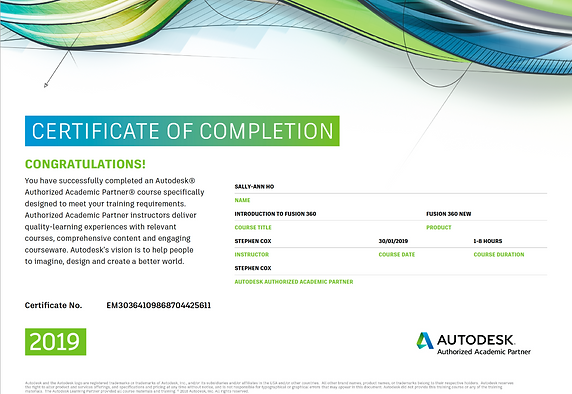
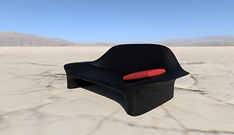
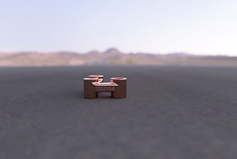
autodesk fusion 360 workshop // 2019


rhino workshop // 2018
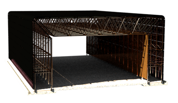
I attended a 5-hour workshop outlining the tools of Rhino. These tools were then used to model The Sainsbury Centre for Visual Arts in Norwich, which was then rendered with the V-ray extension.
![2d axo [Converted].png](https://static.wixstatic.com/media/1e289b_22d97ff3bf2d44e7a7ef801de7d631b2~mv2.png/v1/fill/w_603,h_289,al_c,lg_1,q_85,enc_avif,quality_auto/2d%20axo%20%5BConverted%5D.png)
trashion // 2016
Trashion is an annual charity fashion show that originates from my secondary school Renaissance College Hong. In this fashion show, designers design and create clothes made out of rubbish, which allows for “a new dimension to recycling” to be practiced. This project and event “aim[ed] to increase awareness through combining fashion with trash, hoping to inspire those around us to keep the environment in mind at all times.” For this event I collaborated with a friend where I co-designed and co-created a collection that was based on a layman’s idea of different styles of architecture. Our first piece was inspired by Traditional Chinese architecture; the media used to create this design was newspaper, receipts, Chinese New Year red packets (also called 红包,压岁钱,and 利是), and pieces of red duct tape. Our second piece was inspired by urban architecture seen at night, and was composed of old plastic wrap (used for packaging, used wooden chopsticks, bin bags, wire, and soda can tabs. Our third piece was inspired by eco-friendly architecture where we utilised old plastic wrap, newspaper, pieces of cork, the branches and pine needles of my Christmas tree, and fallen leaves. In our fourth and final design, which was inspired by religious architecture, we utilised old plastic wrap, used wooden chopsticks, coloured plastic shopping bags, and soda can tabs.
software classes // 2015
In my secondary school, I joined the Graphic Design club where I first formally interacted with Adobe Illustrator (see the formation of the ring) and InDesign (see the Bali pages), as well as learnt about typography and visual communication. I then applied what I had learnt to help with the formatting of the school Year book.


